
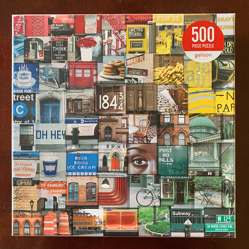
I’ve had my eye on this one for quite a long while. I love the theme and the composition. When it went on sale at Puzzle Warehouse I snagged it (along with nine other puzzles….hum de dum….this is a definitely a normal amount of puzzles).

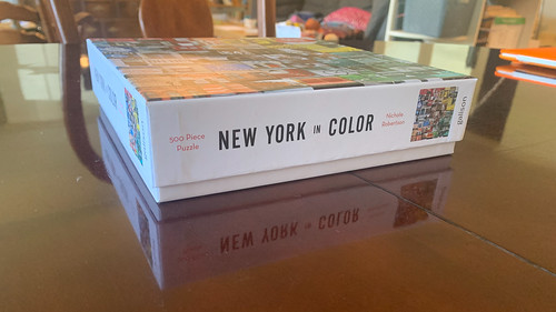
Galison does a great job with their box design, going for a clean and minimalist look that doesn’t feel cheap. The puzzle image covers the entire lid. The sides are a bright white with spare text– the name of the puzzle is in a bold, black font with the piece count and artist written much smaller but done in red for some contrast.
The sparse design means sacrificing the prominence of the image preview but in my opinion, it works. All of the publishing, materials, and sizing details are reserved for the back of the box. The boxes are quite sturdy and the lid leaves part of the box bottom exposed making it feel a bit like a gift box. In short, their boxes are very well done and look amazing on the shelf. My one quibble is the stupid, bright red stickers they slap on the front. They look like clearance stickers, and they do NOT come off cleanly. If they insist on stickers just stick to black & white.


Inside the box the pieces are packaged in a sealed plastic bag. There is a small poster inside that I think is just the right size for a 500 piece puzzle. I really like that on the back of the poster they also describe the inspiration for the artwork.

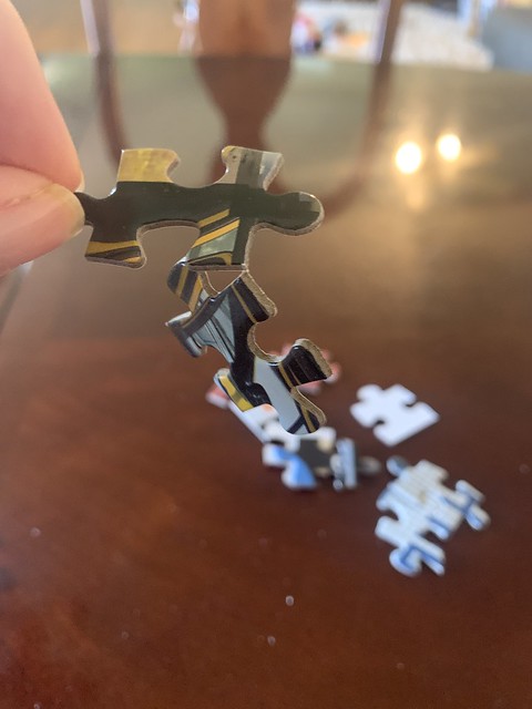
The pieces are a good thickness and generally appear to be well-glued. I found just a couple with some lift. And while there were numerous pairs of pieces that were still attached, they almost all came apart very easily; really they were barely attached by a thread of paper. I did come across one piece that was bent in the middle, I kind of got it straightened out, but I can see it poking up a bit in the finished puzzle.

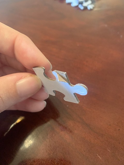

There is a tactile experience when piecing a Galison puzzle that does not please me. It’s difficult to articulate, but the pieces have a brittle, tippy-tappy feel. A Ravensburger or a Pomegranate have a more gentle sound and a softer feel– when you place a piece it’s like it nestles in nice and cozy– whereas Galison pieces kind of clack into place.
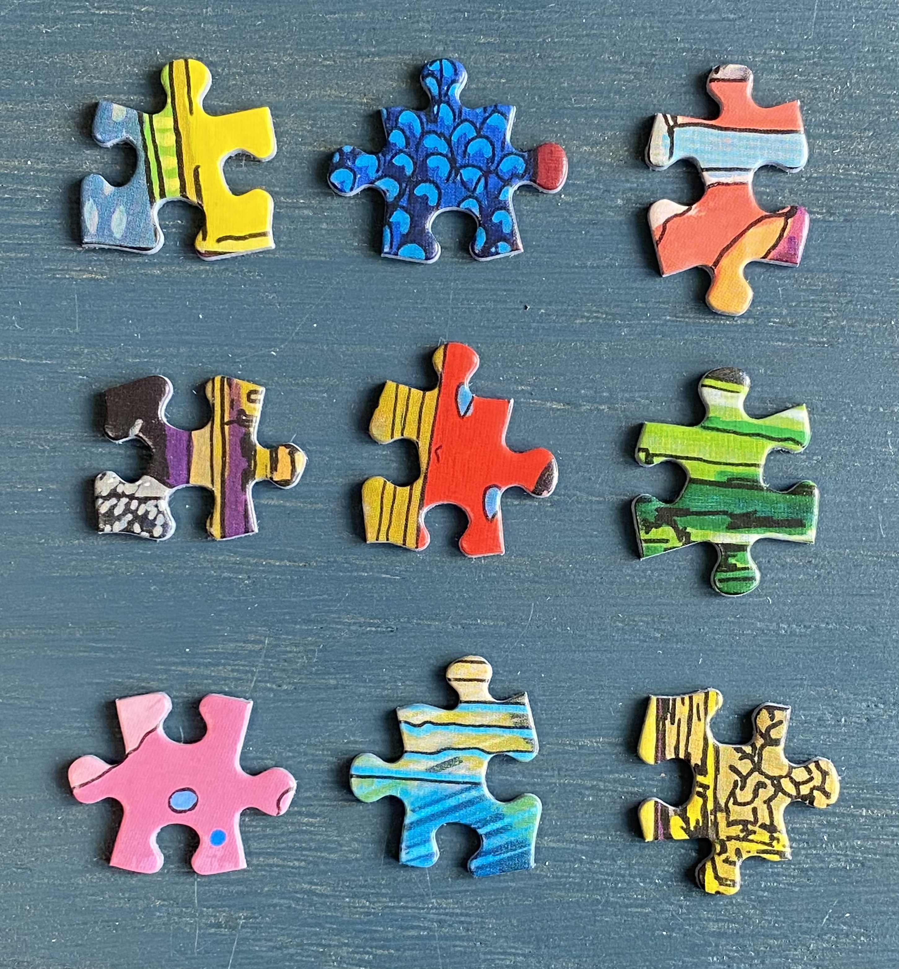
Overall, Galison has decent pieces but they are hardly standouts. My main gripe with Galison really comes down to the quality of the pieces. The puzzle is cut with the standard puzzle piece shape, i.e. every piece has two tabs and two sockets. I suppose it’s fine to stick to a standard piece shape, but including triple tab or triple socket pieces goes a long way towards keeping things interesting. The pieces are thick enough not to be flimsy, but absolutely not premium thickness. Thicker than Eurographics and thinner than Ravensburger or Pomegranate, they come in very close in thickness to a Buffalo Games piece. Similar to Buffalo Games the finish is quite shiny, so you’re going to get lot’s of glare. They also do not stay in place nearly as well when moving sections around.
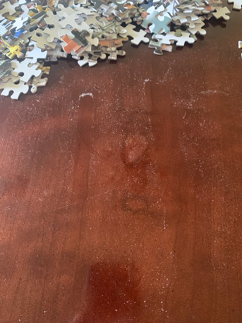
Puzzle dust is minimal.
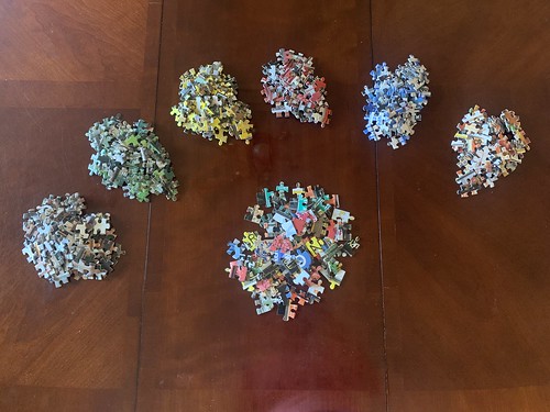
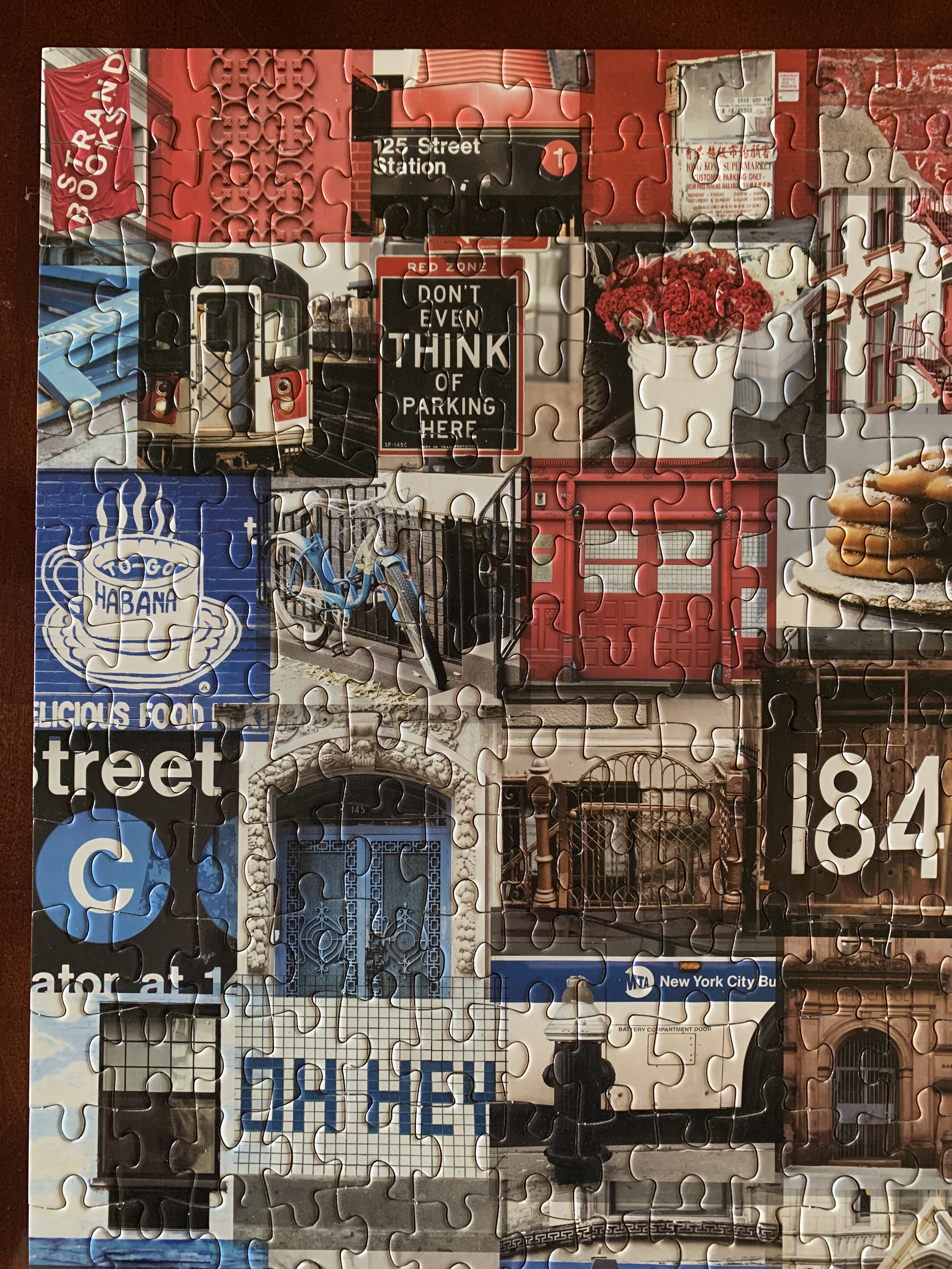
As for the puzzle image and assembly, I thought it was an excellent image and a lot of fun. This is one that a dedicated puzzler can charge through in an hour if they so desired. The color and composition look amazing, super eye-catching, and I love the urban theme without it just being a photo of some buildings or a skyline. This is an easy one to sort. I went with the “single speck” method where you pick a color order and sort out every piece with a single speck of the first color on it before moving on to the next color down the list. I love orange so I started with orange and went clockwise around from there. Orange > Blue > Red > Yellow > Green > Brown.
I can’t say enough good things about the image. It was simply fun. I think this puzzle will hit a sweet spot for those who enjoy puzzling as a relaxation activity, anyone who sits down and works on a puzzle for 15-20 minutes at a time, and families who do puzzles together. For a 500 piece puzzle I’d put this at a 3.5 out of 10 in difficulty.


So, I have very mixed feelings about Galison puzzles. I think the quality is lacking and the pieces have a shape and feel I don’t really love. However, of the major puzzle brands widely available they are absolutely killing it in the art department. They have hands down some of the most attractive, bright, unique images available. They consistently put out a varied selection of puzzles with a range of difficulties, art styles, and piece counts, including shaped puzzles, double-sided puzzles, and exclusive collaborations.
Their art game is top-notch but the pricing on their puzzles is a bit too much. The quality is akin to Buffalo Games but a 1000 piece puzzle will cost you $2-3 more from Galison. Those few extra dollars is enough to make me feel a bit begrudging because I know the quality simply doesn’t justify the price. It feels like I am paying a surcharge to cover the cost of their beautiful boxes, at the expense of the actual puzzle experience. While shelf appeal is definitely important I believe there is likely room to downgrade their boxes to the same basic style that every other puzzle company uses while maintaining the minimalist graphic design. But, also, maybe I’m just an idiot talking crap from her dining room table who knows nothing about operating a paper goods company.
In any case, Galison makes good- not great- quality puzzles. Worth picking up on a sale and occasionally full price if they’ve got an image that just fills your sails, but in my opinion they are a tad too style-over-substance.
