
So, I get it when desert-dwellers rave about the lush green landscape of the east coast. However, the sheer variety of color in the desert is itself stunning. I am an eastern girl down to my bones, the east is my place. But let’s be real about it, in terms of green vegetation it’s basically got three things on offer. Green, darker green, and spring green; and once spring is over……well, you’re down to green and darker green.
Sooo, I love these cacti colors.
Anything that looks like a page out of a plant encyclopedia is going to make me go “oooooh”, and even more if your palette is the soft, dusty hues of the southwest. Yum.
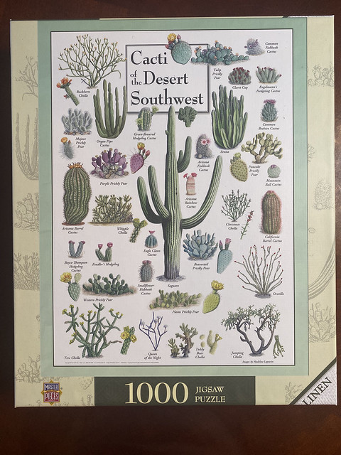
On the table for today I present, ‘Cacti of the Desert Southwest‘ by MasterPieces.

I just reviewed a MasterPieces puzzle about a week ago, but I decided to do this one as well because it is clearly a different line of puzzles with a different production and I wanted to see how they compared. Which, unfortunately leads me directly into my major complaint. I wouldn’t normally open up with a complaint, but this is actually not about the puzzle itself. It addresses the labelling and presentation of this puzzle– you don’t even have to open this puzzle to encounter this irritation, so I’m starting with it now. And probably I’m over reacting, but sometimes a person just has to rant.
This is CLEARLY part of a distinct series of puzzles with entirely different styling to the rest of MasterPieces puzzles. But there is not a NAME for this line of puzzles.
Why?
If you go to their website there are various options in the search bar to filter out puzzles, but none of them filter to this series. If you look up the title of the puzzle, see that it is labelled “Poster Art- Cacti of the Desert Southwest” and then go back to the filter options and type in “Poster Art” manually, nothing comes up.
Why is MasterPieces putting out a new line of puzzles with a different look, different finish, and different price point and then NOT giving it a name? It just seems like terrible marketing, and in a way that makes it annoying for your consumers. I can’t find the other puzzles unless I know their individual titles by name or scroll the entire MasterPieces catalogue. If I want to recommend these puzzles to a friend I can’t give them a search term to use. If I want to discuss the series with a fellow enthusiast I have to refer to it as “You know, the animal and plant posters.”
It reminds me of the complaints I had about their box design. Like they went 80% of the way and called it good.
It is the sorting, categorizing, classifying obsessive in me that is just driven absolutely bonkers by stuff like this. WHYYYYYYYYY? They are charging $3.00 more per puzzle for this line and they can’t be bothered to name it or make it searchable. oh my god.
But moving on. I’ll just take some deep breaths and try to chill. I’m probably, definitely, over-reacting.
The box. The box is pretty nice. Definitely an improvement over the “Inside Out” puzzle I reviewed. They’ve gone for a much more subtle style that looks very gentle, and the soft monochrome coloring ups the sophistication factor by a lot. “Linen” written across the corner is a good feature as their other puzzles are not linen-finish so it’s useful information to share.
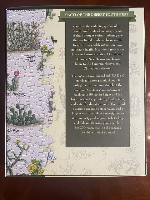
The back of the box is all about the cacti and makes me want to pick up the box and read more. This box drops all the self-promotion that I really didn’t care for and draws you in with the subject matter itself.


I think all the sides of the box look good. The little cacti collage they’ve made for the top side of the box is cute, and the other box sides are cleanly labelled with the title and puzzle image.
And they’ve designed the top side such that it is readable for anyone storing their puzzles vertically.

On the inside box we get the other puzzles available in the series. (One thing though, the ‘Land Mammals of North America’ and the ‘Mammals of Yellowstone National Park’ are an identical set of animals just placed in different configurations……a bit perplexing to me why they’re printing both of those as puzzles.)

I think MasterPieces walks the right line here in terms of box quality. The box is not top-tier quality. It’s a basic level thickness with some minor imperfections in the image wrap. But because the artwork/design is well done it still looks quite good.
What they have done, I assume, is to sacrifice a bit on the box quality and put that cost savings into the manufacture of the pieces. They are producing premium quality-tier pieces while maintaining a 1000-piece puzzle MSRP of $17.99. That is pretty incredible given the prices of puzzles after covid blew everything up. Props.
The only small thing I’d pick at is that I like the artists of a puzzle to get more prominent billing. So I’ll give a little shout out for them here. The poster is published by Earth Sky + Water, with the artwork created by Madeline Logowitz.
BTW, after browsing the Earth Sky + Water website, I am not the only one who badly wants to see this poster made into a puzzle for this series, right?

They’ve got one for the west too!
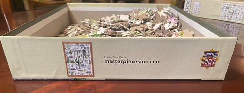
Inside the box they’ve got this interesting little setup. I guess because legitimately the box is a fair bit bigger than it really needs to be, so this is keeping everything in place during transport.
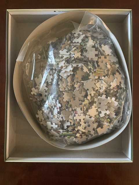
Also, take note of the lack of a puzzle poster. I’m not sure if this is because they made the box big enough they figured they didn’t need a poster. Or if it’s because this artwork is licensed by a poster company…..so they didn’t want posters going out with the puzzles? Who knows. But honestly, I didn’t really miss it while assembling the puzzle. I think the box cover is big enough as an aid.
Puzzle dust? Barely there.

Okay, the pieces!
Over-all, very nice. The linen finish looks great and the sides are cleanly cut. These are just a hair thinner than Ravensburger pieces, so the thickness is good. They are sturdy and well-glued. Found two pieces that were dinged up, no complaints with that. Some of the edge pieces had some strange damage to them. This has got to be from the production process itself, and while I obviously don’t like it, I’m not super bothered by it.
I also kind of like the unique style of the cut on these pieces. I wasn’t sure at first, but the shape of the outies really grew on me. A lot of them have a squarish appearance, while others maintain the more classic rounded shape and I really like the variety. It gives more options for shapes so false fits are rare and it also makes matching pieces by eye that much easier. I’m a fan.


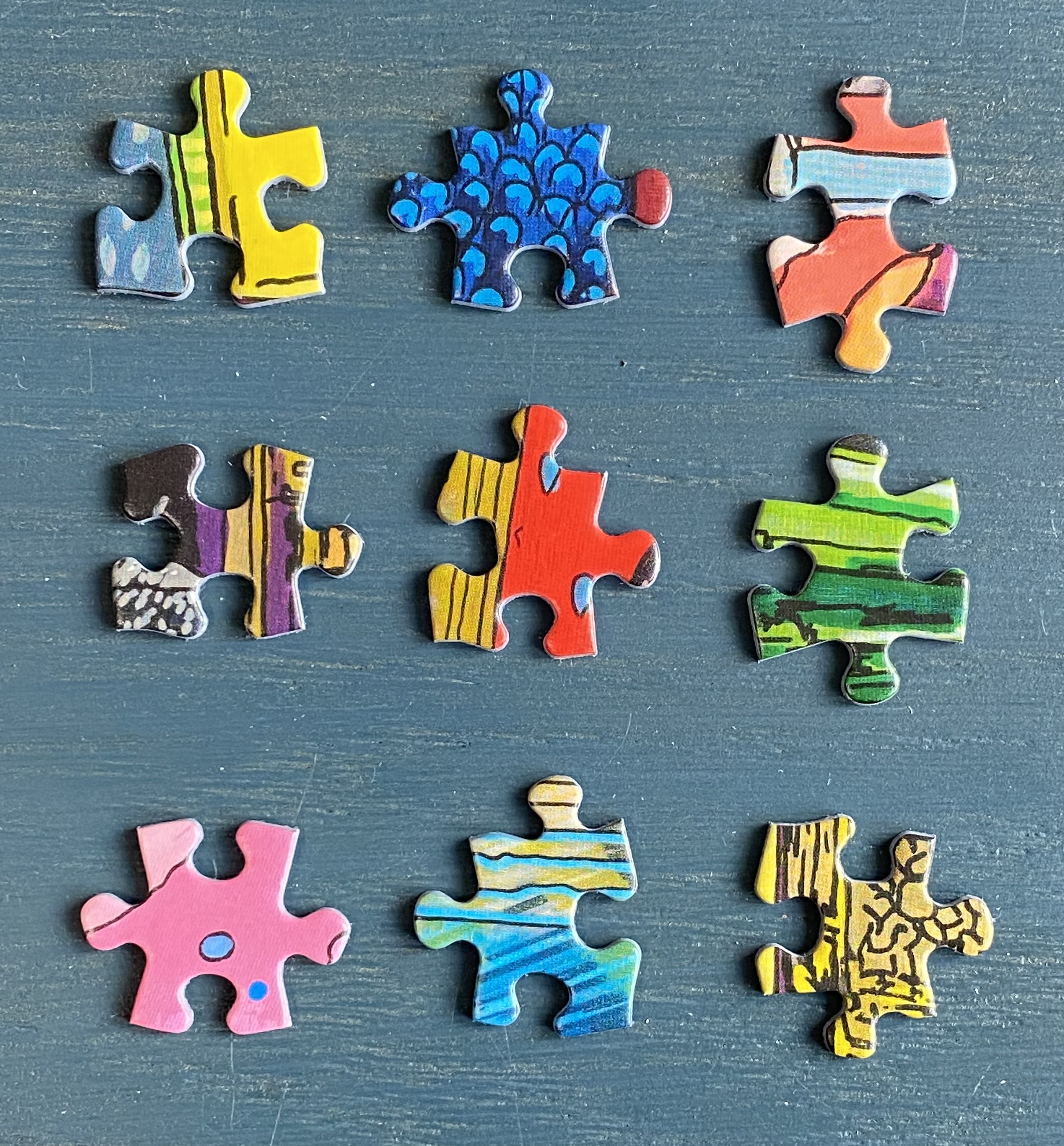
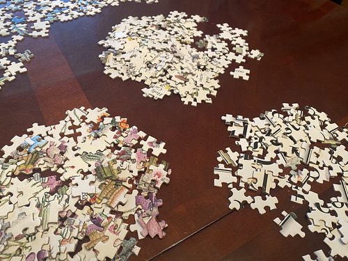
My approach to this puzzle was to sort a few things by the single-speck method and leave the rest for later. I sorted out edge pieces–>poster title–>pink/purple–>cacti names.
This puzzle had a few really good examples of how single-speck sorting works and why it is helpful. You begin by ranking sections/colors by how easy they will be to complete. In this case, I’ve decided pink and purple sections will be the easiest to start with so EVERYTHING with the tiniest bit of those colors must be sorted into that pile.
These three are all pieces that would be sorted into the pink/purple pile. If you sorted by the overall look of the piece you’d have one sorted to a white pile, one sorted to a text pile, and one sorted to a cactus pile.

But imagine, you’ve assembled the pink blooms on a cactus, and one little corner of the bloom is incomplete. How easy is it to see that the piece above with the tiny corner of pink must fit there. In contrast, if you initially sort that piece into the text pile, you are working from a large, cluttered set of pieces with far more chances for incorrect attempts.
Here are my sorted piles below.
Progress after my title and pink/purple piles were completed.

After this I went to the text pile. I’m not sure whether that was the best move or not. It’s kind of tricky because a lot of these share partial names. There are several varieties of “prickly pear” and “cholla” and “fishhook”, so there are lots of opportunities to mismatch names. I think next time I might leave the text for last when I can use the bases of the cacti as a clue to where a piece belongs.

After I got frustrated and set the rest of the text pieces aside I just did simple scan & sort. Most of these cacti have a pretty distinctive appearance so I just browsed the unsorted pieces and starting pulling out ones that stood out. Here’s a sample of some little piles I picked out. The jumping cholla was probably the hardest. The Saguaro I thought would be tough, but it really wasn’t at all because the strong light/shadow makes the pieces very easy to orient correctly.

All finished and looking fine!


Final thoughts. You all know my one big complaint already, so I won’t go on about it here. I actually think the puzzle itself is a complete home run. Beautiful artwork, tasteful and attractive box, high quality pieces with nearly zero false fits, and a very competitive price point. Highly recommended.
On the headphones:
